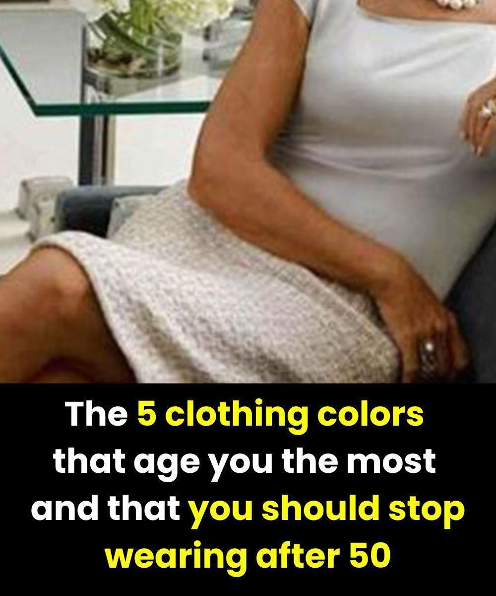
5 Clothing Colors to Be Careful With After 50 — And How to Protect Your Natural Glow
Have you ever slipped on a favorite blouse or sweater, caught your reflection in the mirror, and felt an unexpected disappointment? The outfit fits well. The style still feels like you. Yet something seems off. Your face looks more tired than usual. Your skin appears dull. Your eyes don’t sparkle the way they normally do.
Many women over 50 assume this change comes from aging alone. But often, the real culprit is far simpler and far kinder than that.
It’s the color.
Color has a powerful effect on how light reflects onto the face. Certain shades can soften features, brighten the eyes, and make the skin appear healthier. Others, even fashionable or classic ones, can unintentionally drain warmth from the complexion and highlight shadows, fine lines, or fatigue.
This doesn’t mean your wardrobe needs an overhaul or that style becomes limited with age. Quite the opposite. With a few thoughtful adjustments, clothing colors can become one of your greatest tools for looking refreshed, confident, and vibrant.
Below are five colors many women find less flattering after 50, along with practical ways to wear them differently or replace them with shades that bring your glow back to life.
Why Color Choices Matter More As We Age
Over time, natural changes in skin tone occur. Many women notice a gradual loss of contrast between hair, skin, and eyes. This is completely normal and nothing to fear. However, when clothing colors are too harsh, too muted, or too cool, they can overpower the face rather than enhance it.
Think of color like lighting. The wrong light can cast shadows and make a room feel cold. The right light makes everything feel alive and welcoming. Clothing colors work the same way.
When a shade reflects light softly back toward the face, it creates a rested, healthy appearance. When it absorbs light or clashes with undertones, it can create the opposite effect.
The goal is not to avoid elegance or personality, but to choose colors that work with you, not against you.
1. Black: Elegant, But Often Too Harsh Near the Face
Black has long been considered a safe choice. It’s classic, slimming, and timeless. Many women rely on it because it feels polished and reliable.
However, worn close to the face, black can be unforgiving.
As skin naturally softens with age, pure black can emphasize shadows, dark circles, and fine lines. It may sharpen features in a way that feels severe rather than sophisticated. For some women, it can even make the complexion appear sallow or tired.
This does not mean you must abandon black entirely.
How to wear it better:
- Keep black farther from the face, such as in trousers, skirts, or shoes.
- Pair black tops with soft scarves in warmer shades like ivory, rose, or camel.
- Choose charcoal, soft black, or black mixed with texture rather than flat, inky black.
- Add luminous jewelry near the face to soften the contrast.
Often, it’s not the color itself, but where and how it’s worn that makes the difference.
2. Very Dark Navy: Refined, Yet Surprisingly Heavy
Dark navy is often recommended as a gentler alternative to black. While this is true in many cases, extremely deep navy can behave much like black on mature skin.
When navy becomes too dark and flat, it may absorb light instead of reflecting it. The result can be a face that looks less fresh, especially in indoor lighting.
Better options to consider:
- Royal blue
- Indigo
- Cobalt
- Peacock blue
These shades retain the elegance of navy while adding life and clarity to the complexion. They often make the whites of the eyes appear brighter and bring energy back to the face.
If you love navy, try versions with texture, sheen, or a slightly brighter undertone rather than the deepest shade available.
3. Pale Pastels: Soft in Theory, Tricky in Reality
Pastel colors are often associated with freshness, spring, and lightness. Yet on many women over 50, very pale pastels can have the opposite effect.
When a color is too light and too close to the skin tone, it can reduce contrast. This lack of contrast may cause the face to appear washed out or fatigued.
Soft pinks, pale lavenders, and baby blues can be lovely, but they often work better as accents rather than main garments near the face.
How to make pastels work:
- Choose richer versions of pastel shades, such as raspberry instead of baby pink or sky blue instead of powder blue.
- Wear pale pastels below the waist and pair them with deeper tones near the face.
- Add contrast through accessories, lipstick, or layering pieces.
Pastels are not forbidden. They simply need balance.
4. Khaki Green: Fashionable, But Not Always Kind
Khaki has enjoyed many moments in fashion, especially for its practicality and modern edge. Unfortunately, it can be one of the most challenging colors for mature skin.
Because khaki often contains gray or yellow undertones, it may reflect dull light onto the face. This can highlight uneven skin tone or make features appear harder.
More flattering green alternatives:
- Sage
- Soft olive
- Emerald
- Forest green with warmth
These greens retain the natural, grounded feel of khaki while offering more brightness and elegance. They tend to complement a wider range of skin tones and bring warmth back to the complexion.
5. Neon Colors: Energetic, But Overpowering
Neon colors are bold, playful, and undeniably eye-catching. While they can be fun, they often create too strong a contrast near the face.
High-intensity colors can draw attention to fine lines or shadows simply because the eye is pulled to the contrast rather than the overall harmony of the look.
This doesn’t mean you must avoid them entirely.
Smarter ways to enjoy neon:
- Use neon in accessories such as handbags, shoes, or scarves.
- Choose muted or softened versions of bright colors.
- Keep intense shades away from the neckline and face.
Neon works best as a pop of personality, not the main focus.
How to Choose Colors That Truly Flatter You
Rather than focusing on rules, focus on reflection. When you stand in front of a mirror wearing a color, ask yourself:
- Does my face look brighter or duller?
- Do my eyes appear clearer?
- Does my skin look rested?
Natural light is your best guide. If a color makes you look healthier without effort, it belongs in your wardrobe.
Often, women over 50 shine in:
- Warm neutrals like camel, taupe, and soft gray
- Rich jewel tones such as teal, plum, and burgundy
- Creamy whites instead of stark white
These shades add depth without harshness and support the natural beauty that comes with experience.
Style After 50 Is About Confidence, Not Limitation
There is no expiration date on style. The goal is not to hide age, but to highlight vitality, confidence, and self-assurance.
Color should serve you. It should reflect light, not drain it. It should support your presence, not compete with it.
With thoughtful choices, your wardrobe becomes a source of energy rather than frustration. Sometimes, all it takes is changing one shade near the face to see yourself differently again.
And that glow? It was never gone. It was simply waiting for the right colors to bring it forward.