People Are Noticing an Interesting Detail in the Coca-Cola Logo Posted onFebruary 4, 2026 Byauthor authorNo Commentson People Are Noticing an Interesting Detail in the Coca-Cola Logo
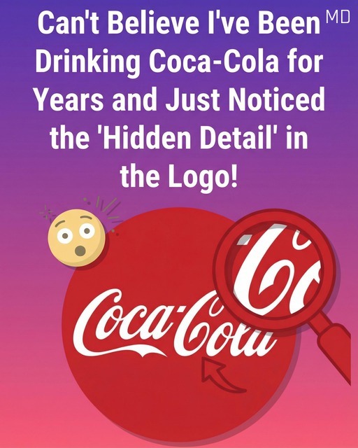
In recent months, many people online have been discussing what they believe is a hidden detail in the well known Coca Cola logo. According to these viewers, the sweeping curve beneath the lettering resembles a smile, which seems to align perfectly with the brand’s long standing association with happiness, shared moments, and simple enjoyment. At first glance, this interpretation feels convincing. Coca Cola has spent decades promoting images of friendship, family gatherings, celebrations, and everyday joy, so the idea that its logo might subtly reinforce those feelings appears almost too fitting to be a coincidence. Social media posts, videos, and comment threads have helped this idea spread quickly, encouraging more people to look closely at a logo they thought they already knew.
However, the actual history behind the logo suggests a much more straightforward explanation rather than a deliberately hidden symbol. The iconic script dates back to the late nineteenth century and was created by Frank Mason Robinson, the bookkeeper for the company’s founder. Robinson chose the Spencerian script style, which was extremely popular at the time and widely used in formal handwriting and business correspondence. This style is known for its flowing lines, decorative curves, and elegant flourishes. When Robinson wrote the company name in this script, his goal was not to communicate an emotional message but to create a distinctive and visually appealing wordmark that would stand out from competitors.
Historical records and design archives do not indicate any intention to embed secret meanings or emotional cues into the logo. The curves and loops were simply natural characteristics of the handwriting style. At the time, branding was far more focused on legibility, elegance, and memorability than on hidden symbolism. Despite this, the logo has remained largely unchanged for more than a century, allowing new generations to project their own interpretations onto it. The idea of a smile may not have existed at the moment of creation, but it feels believable today because of how the brand has positioned itself culturally.
Experts who study visual perception and psychology explain that this kind of interpretation is entirely natural. Human brains are highly skilled at pattern recognition, especially when it comes to faces and expressions. People often see smiles, eyes, or other familiar shapes in objects that were never meant to represent them. When a brand is closely associated with positive emotions, consumers are even more likely to notice and interpret visual elements in a warm or friendly way. Over decades, Coca Cola’s advertising has repeatedly emphasized joy, nostalgia, and togetherness, which shapes how audiences emotionally respond to its imagery.
This evolving interpretation highlights how logos can gain new meanings as culture and collective memory change. A design originally created for practical and aesthetic reasons can slowly accumulate emotional significance through years of shared experiences. Logos are not static pieces of art frozen in time. They live in the minds of the public, influenced by stories, advertisements, and personal memories. Whether the curve in the Coca Cola logo was ever meant to resemble a smile or not, the fact that so many people see one today demonstrates the powerful relationship between branding and human perception. It shows how audiences actively participate in creating meaning, allowing familiar symbols to grow and adapt alongside the communities that embrace them.


